Pure horizontal jet
A pure horizontal jet is the simplest test case, which is also investigated in
numerous experimental studies. The config.toml file looks like this:
# Characteristics of the pipe and the effluent flow
[pipe]
time = [1970-01-01]
flow = [0.2]
dens = [1000]
diam = [0.5]
depth = [100]
decline = [0]

# Characteristics of the ambient water masses
[ambient]
time = [1970-01-01]
depth = [100]
coflow = [[0]]
crossflow = [[0]]
dens = [[1000]]

# Output options
[output]
csv.file = "out.csv"
csv.float_format = "%.6g"
trajectory.step = 5           # Time between trajectory points [s]
trajectory.stop = 30          # Time of final trajectory point [s]
release.start = 1970-01-01    # Time of first release [date]
release.stop = 1970-01-01     # Time of final release [date]
release.step = 3600           # Time between releases [s]
We run the example from the command line as
python -m effluent config.toml
or from within python as
import effluent
effluent.run("config.toml")  # Alternatively, just pass a dict
This produces an output file named out.csv:
release_time,t,x,y,z,u,v,w,density,radius,dilution
1970-01-01,0,0,0,100,1.01859,0,0,1000,0.25,1
1970-01-01,5,2.67114,0,100,0.362106,0,0,1000,0.704095,2.81979
1970-01-01,10,4.20059,0,100,0.264651,0,0,1000,0.964101,3.864
1970-01-01,15,5.39823,0,100,0.218734,0,0,1000,1.1677,4.68487
1970-01-01,20,6.41637,0,100,0.190506,0,0,1000,1.34078,5.37954
1970-01-01,25,7.31774,0,100,0.171126,0,0,1000,1.49402,5.99992
1970-01-01,30,8.13534,0,100,0.156561,0,0,1000,1.63301,6.55811
We load the output data using pandas
import pandas as pd
df = pd.read_csv("out.csv")
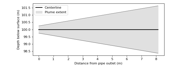
and plot the centerline and plume boundary using matplotlib
import matplotlib.pyplot as plt

x = df.x.values
center = df.z.values
upper = df.z.values + df.radius.values
lower = df.z.values - df.radius.values

plt.plot(x, center, color='k', linewidth=2, label='Centerline')
plt.plot(x, upper, color='k', linewidth=.5)
plt.plot(x, lower, color='k', linewidth=.5)
plt.fill_between(x, lower, upper, color="#e0e0e0",
                 label='Plume extent')

plt.xlabel('Distance from pipe outlet (m)')
plt.ylabel('Depth below surface (m)')
plt.gcf().set_size_inches(8, 3)
plt.gca().set_aspect('equal')
plt.legend()
plt.tight_layout()
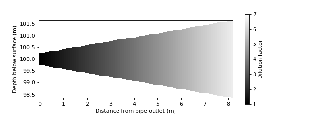
Tracer concentration is proportional to plume speed and cross-sectional area. Here is one way of visualizing the concentration evolution:
import numpy as np

# Extract data
x = df.x.values
z = df.z.values
r = df.radius.values
element_volume = df.u.values * (r ** 2)
dilution = element_volume / element_volume[0]

# Plot plume dilution factor
xx, zz = np.meshgrid(
    np.linspace(x[0], x[-1], 100),
    np.linspace(z[-1] - r[-1], z[-1] + r[-1], 100),
)
rr = np.interp(xx, x, r)
dilu = np.interp(xx, x, dilution)
dilu[(z[0] - rr > zz) | (zz > z[0] + rr)] = np.nan
plt.pcolormesh(xx, zz, dilu, cmap='gray', clim=(1, 7))

# Set visual plot properties
cbar = plt.colorbar()
cbar.ax.set_ylabel('Dilution factor')
plt.xlabel('Distance from pipe outlet (m)')
plt.ylabel('Depth below surface (m)')
plt.gca().set_aspect('equal')
plt.gcf().set_size_inches(8, 3)
The plume edges are defined using the top-hat profile, as described in Algorithm. If desired, we can visualize the plume as a gaussian profile instead. In a round gaussian plume, the centerline concentration is twice as large as the corresponding top-hat mean concentration. The top-hat radius equals the gaussian radius times the square root of two.
# Plot fuzzy plume
depth = df.z.values[0]
cm = 2 * np.interp(xx, x, 1 / dilution)
conc = cm * np.exp(-(zz - depth)**2 / (0.5 * rr**2))
dilu = 1 / (conc + 1e-7)
plt.pcolormesh(xx, zz, dilu, cmap='gray', clim=(1, 20))

# Plot centerline and edges
rad_gauss = df.radius.values / np.sqrt(2)
lgauss = df.z.values - rad_gauss
ugauss = df.z.values + rad_gauss
plt.plot(x, lgauss, color='r', linewidth=.5, label='Gaussian radius')
plt.plot(x, ugauss, color='r', linewidth=.5)
plt.plot(x, upper, color='k', linewidth=.5, label='Top-hat radius')
plt.plot(x, lower, color='k', linewidth=.5)

# Set visual plot properties
cbar = plt.colorbar()
cbar.ax.set_ylabel('Dilution factor')
plt.xlabel('Distance from pipe outlet (m)')
plt.ylabel('Depth below surface (m)')
plt.gca().set_aspect('equal')
plt.gcf().set_size_inches(8, 3)
plt.legend()
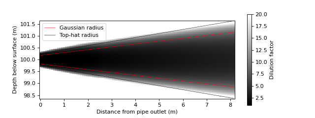
The assumption of gaussian distribution is invalid close to the plume outlet. A correct representation requires a model of the Zone of Flow Establishment. This is currently not implemented.